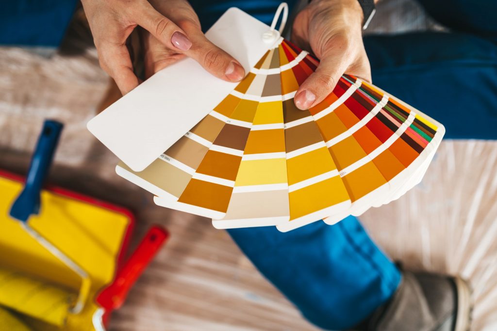
In house design, color trends are very important as they affect not only the visual attractiveness but also the atmosphere and mood of living areas. Depending on the colors used, the proper ones may improve the mood of a room and either tranquil or stimulating a place. A plethora of interesting and modern ideas for homeowners wishing to update their interiors accompany 2024. Rising color trends provide distinctive palettes that appeal to many preferences and represent personal styles, therefore inspiring innovation. From calm neutrals to vivid accent colors, the 2024 trends promise to arouse feelings and change environments, therefore enhancing their appeal and reflecting of particular personalities. Following current color trends helps homeowners to rethink their surrounds, therefore improving not only the design but also the complete impression of their houses. For everyone wanting to redesign their homes, 2024 is a great year as new colors are just over the horizon.
Earthy Tones for Warmth and Comfort
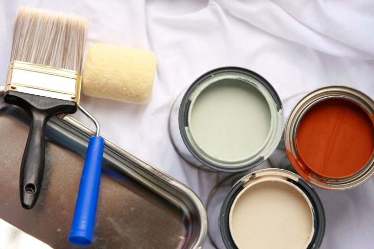
Warm, earthy colors like rust, olive green, and terracotta are becoming more popular again, and this has a big impact on interior design. These colors, which make you think of nature, make the whole house feel calm and peaceful.
Terracotta is great in living rooms to provide warmth and a rich background for furniture. Added to by natural elements like stone and wood, it creates a welcoming environment for events. Olive green also brings a calm, peaceful atmosphere evocative of verdant settings. Any bedroom may find a peaceful refuge by using this flexible color on accent pieces, furniture, or walls.
On the other hand, rust provides a closer warmth that would make kitchens look more earthy and welcoming. Rust guarantees the space remains dazzling and airy when utilized with white or light neutral elements, therefore accentuating its richness. The comeback of these earthy colors not only improves the visual attractiveness of houses but also creates a feeling of comfort and peace, therefore improving the enjoyment of the places for daily life.
Soft Pastels for a Calming Vibe
In interior design, calm effects of soft pastel hues such powder blue, blush pink, and light lavender have made them very popular. Especially in bathrooms and bedrooms, these colors provide a peaceful atmosphere ideal for places designated for relaxation.
Powder blue creates a calm atmosphere fit for comfortable slumber by reminding one of clean sky and therefore of serenity. Its softness brightens without overloading the senses. Blush pink brings warmth and a soft touch that helps one to experience comfort and emotional equilibrium. This color is particularly good in bedrooms as a calm surroundings is necessary to relax after a demanding day.
With its touch of humor, light lavender creates peace and inspiration. This pastel tint is ideal for bathrooms as one wants to relax during bath time and it helps to reduce tension. These soothing pastel tones used together improve a house’s overall look and support mental health by allowing one to escape the daily grind. Soft pastels let homeowners create calm, serene havens in their homes.
Bold Jewel Tones for a Luxurious Touch
Interior designers and homeowners both have taken notice of the growing trend in strong jewel tones such amethyst purple, sapphire blue, and emerald green. These rich, deep hues are becoming more and more popular as they may inspire in any environment elegance and refinement.
From contemporary to classic décor, jewel tones provide a sophisticated background that accentuates many designs. Their vivid colors provide warmth and depth, which makes them ideal for accent walls—where they may be the focal point that accentuates the whole visual appeal and directs the attention. Furthermore, statement furniture covered in these striking hues may change a space and provide flair and a little luxury.
Including jewel tones into home design lets one express creatively while still keeping a polished appearance. They accentuate the sophistication of rooms without overpowering them when they go well with neutral palleties. These hues are becoming more and more popular and are once again classic options that improve the atmosphere of any space and inspire people to savor the opulent experience of their houses.
Vibrant Neons and Brights for Fun Accents
Bright neon and vivid hues such lime green, hot pink, and electric yellow give rooms vitality and inspiration. These colors will help any space into a vibrant and interesting place. These vibrant colors help home offices greatly as they inspire creativity and inspiration, therefore transforming the nature of work from a task to an adventure.
Bright colors in playrooms inspire imagination and happiness by themselves. Neon accents may transform everyday settings into remarkable ones that encourage kids to investigate and learn in an interesting surroundings. Anybody entering the house will be immediately excited by an entrance covered in strong colors, therefore establishing a happy tone right from the beginning.
Including these brilliant hues might be as simple as adding artwork, accent furniture, or decorative pillows. Neon colors especially stand out as they enhance the delight by contrast with neutral backgrounds. Whether one decides on a single statement item or a consistent color scheme, brilliant neons and powerful colors provide the best opportunity to express uniqueness and creativity in all surroundings.
Monochromatic Schemes for Cohesion and Simplicity
Modern interior design has embraced monochromatic color schemes, which define themselves by the use of variants of a single hue to provide a coherent and unified appearance. This tendency lets rooms seem bigger and more harmonic as it lets the flow between them be flawless. Designers add depth and intrigue using many tones, tints, and hues of one color without overpowering the senses.
In minimalist homes especially, this approach is very crucial as it stresses simplicity and hygiene. Lack of opposing colors lowers visual complexity and lets a finished design remain peaceful and clever. Because all aspects of monochromatic designs are derived from the same color family, they also help to easily coordinate furniture, accessories, and fabrics.
Monochromatic designs are very attractive as they may vary from strong, vivid colors energizing a place to calming pastels creating a quiet setting. This approach is perfect for modern, simple homes as it not only promotes cohesiveness but also improves the general atmosphere.
Conclusion
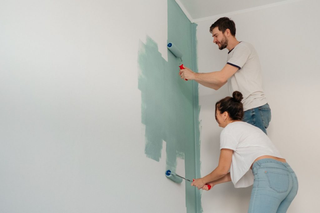
From contemporary minimalism to rustic appeal, the top color trends for 2024 encompass a varied palette that may readily improve many house designs. While earthy tones like soft terracotta and deep sage green are making waves and adding warmth and peace into homes, vivid colors like coral and mustard yellow provide happy energy and enthusiasm. These colors may be simply integrated into any room using accent walls, furniture, or décor to provide a distinctive style appealing to certain interests. Homeowners are urged to play around with these colors, mixing and combining to create unique ambiance that capture their own style. Readers may also look at “color inspiration and trends” blog, which provide instructions on attaining the right finish and applying these trends correctly, thereby maximizing the effect of these new colors. Combining creativity with the newest color trends will let individuals upgrade their houses and turn them into vibrant, inviting sanctuaries expressing their own style preferences.

